Contents
What if you could know what on your competitors’ web pages is effective for visitors, and what isn’t, and could compare that with your own pages? Wouldn’t that be great? Now you can!
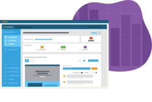
WEVO can tell you what potential customers like and dislike about your page AND what they like and dislike about any of your competition’s web pages. Plus, you can see if there are differences in how different visitor segments view each page. Discovering what a competitor is doing well and how their success can improve your own conversion efforts is something every smart digital marketer should be doing.
Let’s consider three tests to see just how effective this tactic can be. WEVO recently tested the checking offer landing pages of six major financial institutions to see what digital marketers can learn from each of them.
Ally Bank vs. SunTrust Bank – Candor and transparency come out ahead
In a WEVO of Ally Bank’s interest checking offer page, potential customers seemed to really connect with the image of a happy woman and a high interest rate offer on the top of the page. When compared with a similar offer from SunTrust Bank’s, it’s easy to see why Ally’s page performed better. Ally’s checking offering are listed up front and presented in a clear, concise manner that target visitors found refreshing and enticing, whereas SunTrust hides the details, and the requirements, in a much smaller text block, well below the offer.
BMO Harris vs. TD Bank – Relatable images win customers
In a WEVO of of BMO Harris’ checking offer landing page, BMO was able to capture attention of visitors with a picture of a large dog looking down at a smaller dog. This approach was two-fold, conveying that they have better rates and attracting visitors to continue exploring the page with a photo of two adorable dogs. Since most visitors spend only seconds on a landing page, it’s essential to capture their attention from the start, and BMO Harris clearly understands this concept. The Citizens Bank page, on the other hand, consists mostly of text with a generic stock photo of someone reading. Unlike BMO Harris, the TD bank isn’t grabbing the visitors attention with enough appeal for them to continue on to the offer details. The takeaway? Using a creative image allows you to capture your visitor’s attention and give you enough of their time to convey your offer.
PNC Bank vs. Wells Fargo – Keep it Simple Silly
In a WEVO of PNC’s landing page, prospective customers fears of complexity surrounding opening a new account were put to rest through simple use of icons. This breakdown of opening an account and the benefits of a PNC savings account helped visitors to evaluate the details, and feel more comfortable taking the next step. The vast majority of prospective customers said they felt the information they needed to evaluate the offer was clear, concise, and easy to find. Wells Fargo’s checking offer page, on the other hand, used an abundance of text on their landing page to describe the offers. While they did have an attention grabbing image of a father carrying his son to convince visitors to stay on the page, once they had made it past the image, visitors weren’t resonating with the page. Prospective customers were bored with the bullet list of features and requirements – just listing information simply listing information is unappealing to the average visitor, and may even confuse them. Because of this, the Wells Fargo page scored much lower than the PNC page. PNC’s use of simple, creative icons told customers what they need to know while making the information simple to process.
Getting Feedback from your Target Audience
Gathering intel on competitor pages can also inform your marketing tactics. Once you’ve determined what features or components of the competition’s campaign is most enticing to prospective customers, it’s a relatively straightforward process to implement those elements into your own campaign or even to remove details that may not be as appealing as you initially thought.
Understanding what works for your competition is one of the most effective ways to learn more about your visitors and what they need to convert. WEVO is a fast, inexpensive way to research your competition (and your own pages). Understanding your shared audience is the only way your marketing will be effective. Testing your pages against your competitors pages will help you understand your audience.