Contents
- 1 1) Changing button colors may improve conversion somewhat, but larger growth will only come from really understanding what visitors need.
- 2 2) Path to purchase, user experience and website conversion testing are related but not the same.
- 3 3) Headlines often fail to speak to the emotional needs of site visitors.
- 4 4) Website social proof points are necessary and need to be authentic.
- 5 5) Website imagery matters more than you think.
- 6 6) Site navigation is an engagement tool.
- 7 7) Dare to be… differentiated.
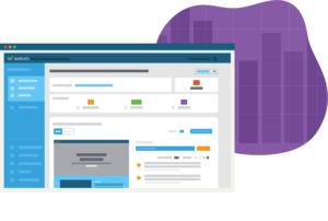
WEVO is an AI platform that gives digital marketers insights and recommendations on how to improve the conversion of webpages. Our technology generates results in less than a week, allowing us to rapidly test and gather data about what specifically will improve the efficacy of a page. With all of this time spent gathering insights, we’ve noticed there are some best practices that remain constant no matter the industry, audience or page. Here are the top seven.
1) Changing button colors may improve conversion somewhat, but larger growth will only come from really understanding what visitors need.
We’ve seen that while page conversion can be improved with small changes like button color updates and navigational tweaks, there is no substitute for getting in the heads of your visitors in order to understand why they are converting or not converting on your site.
2) Path to purchase, user experience and website conversion testing are related but not the same.
Understanding a prospective customer’s path to purchase is part of any good marketing department’s goals. Marketing teams often unearth great information for their marketing campaigns and strategies. But, once these campaigns result in a website visit, it is critical to know what your visitor needs to see in order to engage, today. Customer experience and usability tests are great as they focus on rational/logical needs, but may not uncover what will truly motivate engagement.
3) Headlines often fail to speak to the emotional needs of site visitors.
Headlines should address both the emotional and rational expectations that prospects have when they visit your site. Visitors may give your page 5 – 10 seconds, at most, before deciding whether to continue or leave: the headline (and subhead) are the most impactful way to prove that you are the place they should be. The results we’ve seen prove that headlines which address both the hopes, dreams and fears of visitors are more successful than those that address purely rational need.
4) Website social proof points are necessary and need to be authentic.
Visitors are looking for proof points that provide credibility. Often, these include elements such as testimonials, social ratings and reviews, accreditations and supporting statistics. Visitors are savvy about these elements and have become increasingly skeptical of the source of the review, statistic or quote. They consider the absence of valid proof points to be a major speed bump. Savvy marketers should look to find authentic, relevant and believable quotes, statistics and proof in order to minimize the skepticism and maximize credibility.
5) Website imagery matters more than you think.
Visitors read more into your images (or lack thereof) than we think. While many designers look at where the hero image has light and dark areas, where they can add text, and if the image matches the company brand, visitors are looking for other cues subconsciously asking themselves questions such as: Does the person in the image look like me? Is this service for people like me? Does this image embody my aspirations? And is the image relevant to my goals? Once you understand who your visitor is, and what they aspire as a result of your service, it is easier to select the right images for your site.
6) Site navigation is an engagement tool.
What your visitor absorbs in the first ten seconds of their visit is your make or break for conversion. We’ve discussed headlines, hero images and other website elements, but the navigation is also an element that gives your visitors an “at a glance” clue to what they will or will not find if they spend time on your website. Consider using navigation to cover key topics you know are on your visitors’ minds (e.g. for higher education, “paying for school”) to let them know they can get their questions answered by investing more time.
7) Dare to be… differentiated.
Well over half of the WEVO tests that have been run in the past 2 years find that visitors fail to see how one website is different than another (e.g. competition.) It is likely that you will have similar information (For example, if you are in higher education you likely have programs, degrees, tuition/payments). But, you should also have a positioning that represents your unique value. And, that value should be clear and consistent throughout your page.
What web page recommendations do you have?
Visit www.wevoconversion.com to learn more and schedule a demo of the WEVO platform. Or contact us here.